Displaying Multiple Images
There are several ways to display a number of logically connected images on an Oxygen site. Let's say you have 35 images that you want to display in a group. What are your options? You could do any of the following.
Display All Images Inline, Full Size
You could choose to list all 35 images, at full size, one after another on the page. But you may consider 35 images to be too many to display all at once. That many full-sized images will make the page very long, and if you do not take evasive action, the page's ranking may be negatively affected.
Displaying lots of images one after another, or in between paragraphs, can make a page heavy - and therefore slow. Google hates slow pages.
You could try lazy loading the images to help reduce the burden of weight on the page. Lazy loading means the images are not loaded unless the user scrolls far enough down to see them. Lazy loading is a just-in-time loading of images.
Displaying many full-sized images will also use a lot of vertical space. You have to make a judgement call. If you only have 8 images to display this method can of course work well. If you have 35 to display, you might want to think of something else.

Display Images In A Slider
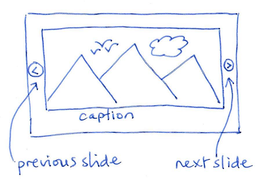
In terms of page real estate, a slider is more space efficient. It only takes up the space of one image, because the other 34 images are hidden until they slide into view. It will depend on the slider plugin you use, but many sliders will lazy load images when they are needed.
This means your page won't necessarily have to load all 35 images to get started.

Typically, the user only gets to see one image at a time and must wait for each image to slide into view, or use the controls to manually slide though each image. As users are often in a hurry, a slider may not be the best solution if you want to make sure images are seen.
Also, despite us website creators finding sliders easy to use, many users do not. They can be irritated by having to think about which buttons to click in order to find the information they need.
Worse, if the information is not literally presented there, in front of the user, they might not make the effort to seek it out. This is why complicated, overly clever, cryptic or non-intuitive interfaces often are self-defeating.
Display Images In A Gallery
A gallery is a coherent display of thumbnail images. Because all images are shown at once, the user can easily survey all the thumbnails. If any catch her eye, she can click it to view the large image that the thumbnail represented.
Optionally, clicking any single thumbnail can initiate a light box display of all the images represented by the gallery thumbnails. A lightbox will also display the large version of the image represented by the clicked thumbnail, but additionally it will allow the user to then manually swipe through all the other images in the gallery to view them at full size.
A gallery may take up more space than a slider if you have a lot of image thumbnails. But you can normally control the size of the thumbnails to control to some extent, the space used.

Advantages Of A Gallery
The advantage of a gallery is that the user can quickly scan all the images and click the one they want to view at a larger size. In the case of a slider they may never wait long enough to see all the images slide by, so your work or message may be essentially hidden.
When clicked, the thumbnail will appear full size in a virtual lightbox. With a gallery, nothing is hidden on the initial view. This is more likely to entice people to look at all your work. Galleries make it easy for the user to stay on the page and develop interest in the content.
The other advantage of course is that the larger version of the image is not loaded unless the user requests to see it in the lightbox.
Once the lightbox is opened, the remaining images can be viewed through the lightbox, at which point the gallery becomes rather like a slider. Obviously at this point you are again relying on the user's willingness to interact with the lightbox user interface to navigate through the sequence of images. But at least with gallery having exposed everything to them initially, the visitor is more probably more likely to investigate the images further.
Some Gallery Options
I've written some blog posts to help you get started with galleries easily.
- You can start with the built-in WordPress Gallery Block
- This can be further enhanced with the free SimpLy Gallery Plugin
- Or you can use the Oxygen native gallery element
Lightboxes Are Optional
Most galleries do come with lightboxes built-in but some do not. Bear in mind it is also possible to load a gallery of thumbnails and leave it at that. I.e. just an organised display of thumbnails that are not clickable. If you choose large enough thumbnails, you may achieve your goal with the gallery alone and allow the page to be remain relatively lightweight.
