Using The Oxygen Builder Gallery Element
So I've covered using the WordPress Gallery Block elsewhere. But what if you prefer to use an Oxygen element? Maybe you are building a page out in oxygen and it's just not possible to pull in the Gutenberg blocks you need via inner content, in all the places you need them. In this case, an Oxygen gallery element would be so much more convenient.
The Oxygen Gallery element is a standard part of the Oxygen and works off images held in the WordPress media library. It has two layout modes
- flex
- masonry
Does The Gallery Behave Responsively?
I found that the flex layout worked well out of the box in that the layout looked good - but it was not responsive. The masonry layout also looked great. but it is not a true masonry function in that it does not dynamically rearrange itself if the screen changes size.
I did not investigate how to make it behave with true masonry functionality nor responsively. It may not be important for you to do so either. If you do want to find out more about achieving this however, you can refer to this blog post.
To qualify as responsive, the gallery should reduce the number of columns displayed as the size of the screen decreases. But in both the case of the flex layout and the masonry layouts, all that happens on smaller screens is that the thumbnails become smaller. I wasn't able to use Oxygen's visual built-in breakpoints to easily address this as they don't work with the Oxygen gallery.
Masonry Layout Issues
Large Spaces Between Thumbnails
If you find that your Oxygen masonry gallery looks odd with large spaces between the thumbnails, you can address this easily by choosing larger thumbnails or by applying this CSS (as seen in the video).
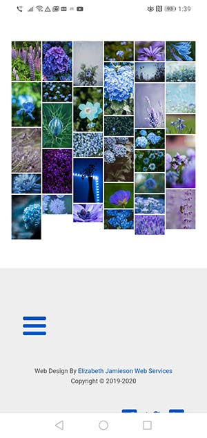
Mobile Phone Screenshots Of The Oxygen Gallery


Google may notice that a site is not mobile friendly if text is too small on a phone, or if clickable items are too small. To avoid this problem with the Gallery, keep the number of columns to around 3.
